Monday 7 May 2012
Sunday 6 May 2012


Thursday 22 March 2012
Tuesday 7 February 2012
Monday 6 February 2012
Tuesday 10 January 2012
Task 1 - In what ways do your media products use, develop or challenge forms and conventions of real media products?
In what ways do your media products use, develop or challenge forms and conventions of real media products?

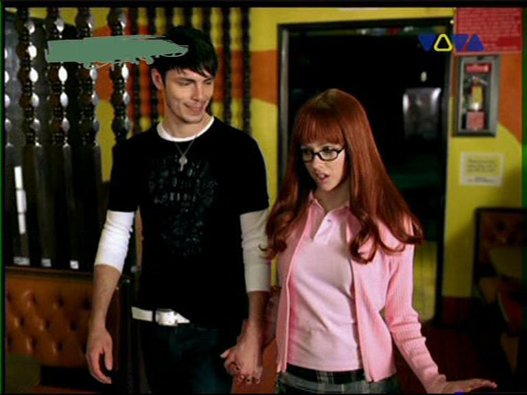
Our story, like "Thriller", "Pump It" and any Lady Gaga music video, had to be established and introduced. "Flyswatter" is a story and a journey with a heavy narrative about a girl stumbling upon a house of washed-up-next-to-nothing fairytale characters. Using pre roll helped us to introduce the characters and the basis for this story which is continued throughout the duration of the video. This conventional method of telling a story is extremely useful.

We were heavily influenced by the mise-en-scene to tell the story - a lot of symbolism was used to convey hidden meaning and messages. For example, the pills around Sleeping Beauty suggest an addiction or absence of serenity she is famous for in her self-titled novel. The leather bound books stacked on the staircases are all fairy tales, the one on the top happens to be Alice In Wonderland. The princesses fighting over the crown show a different side to the glorified heroines, now they are greedy and possessive, fighting over power and wealth instead of love and hope.


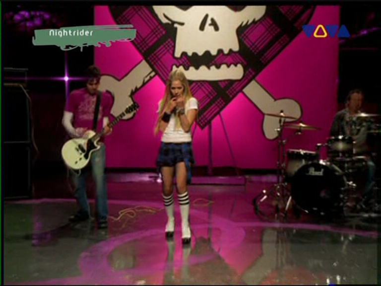
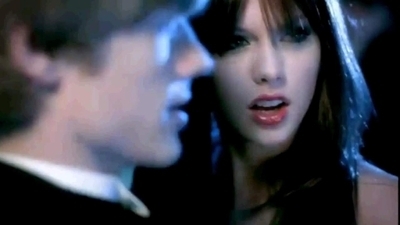
Our performance element was originally going to include a band appearance however due to certain circumstances we could only get our lead singer to lip sync the words. Nevertheless, this still is our employment of conventional performance elements to endorse both the singer, the song and the music video. However, we used an unconventional technique by using the main singer as the main character as well. Immersing him completely in the storyline and narrative. Mainstream examples of this would be Avril Lavigne's joint parts in her song "Girlfriend" where she performs and plays both the villain and the victim. Taylor Swift does this in her song "You Belong With Me" where she also plays the heroine and villain. This is a simple solution for balancing the performers persona. The artist (singer or band) wants to appear both vulnerable and empowered - something applicable to the teenage crowd at a time when searching for one's identity and growing up are important to every individual.
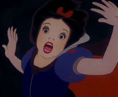
The symbolism of the Mad Hatter's Tea Party represents the embodiment of all things magical, lavish and crazed. After visiting all the other fairytale characters, we return back to the story of Alice In Wonderland - as a sort of crescendo to the symbolic tea party table and members. The appearance of the table is identifyable to all ages of audience members, for adults it is nostalgic and symbolic of their childhood, for teenagers it is symbolic of their transgression into adulthood and for children it is the coming-to-life of a beloved fairytale. Of course this certain fairytale is a dark one and targeted subliminally toward an older audience (16-24) like most fairy tales involving deep meaningful themes children would not pick up on until they have reached adulthood. Most famously, the fairytale of Snow White.


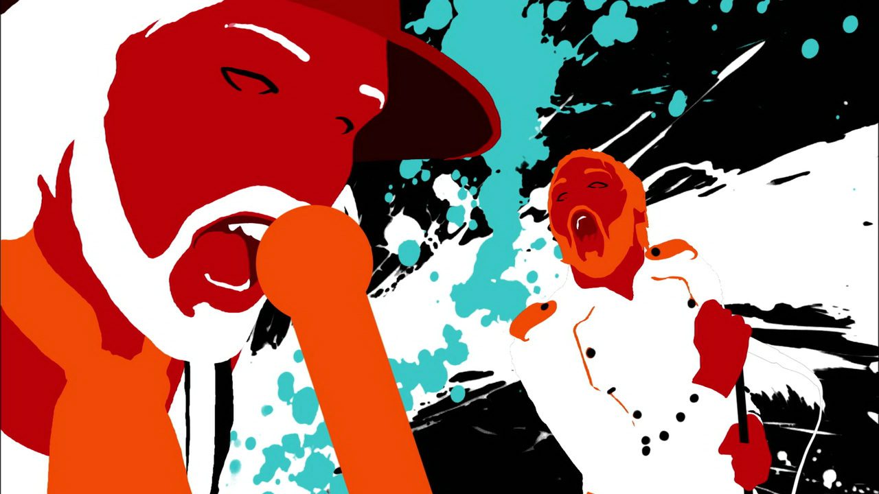
Breaking the rules of convention, we used a lot of unnatural, physcodelic and loud colours with our lighting, costumes and mise-en-scene. This was to convey a sense of disorientation and disorder. To over brighten the pastel colours of conventional fairy tales. The colours are highly symbolic of the mood and scenario taking place, this again, is to reiterate the sense of phsycodelia. Teenage audiences would response to this quite strongly, it evokes the feeling of a "trip" and also the loudness of the colours boils the idea of a childhood revisited. Bright block colours are incredibly effective, more effective than reverting back to black and white in my opinion, music videos like Kasabian's "Shoot The Runner", Paramore's "Misery Business" and Nicki Minaj's "Superbass" effectively use loud colours to embody the mood of a song and delight audiences visually. Nicki Minaj's video even goes so far as using neon, ultraviolet lighting making everything distorted and negatively coloured. Reiterating that sense of physodelia.


Our Digipak:

 This is the front cover of the digipak which is quite simple. This is quite a conventional album cover for this indie style music. However, a lot of new upcoming bands would have a picture of them or some way of recognising who they are which ours doesn't. Our writing is also quite small, but I think all of this works quite effectively as it makes the viewer engaged with the CD. This is why the inside cover is supposed to have such a huge impact. Our main CD cover was inspired by the new RED HOT CHILI PEPPERS's album cover, "I'm With You". The simplicity of the cover is dramatically effective and echoes a feeling of corruption and contamination (the fly on the pill). We really wanted to echo this idea, the idea that there is something deeper than what you first see. We really were attracted to the idea that there was something bottled up in the pill that was just waiting to explode. This is why the CD cover (both front and back) is mockingly sterile. And the inside is an explotion of animation, imagination and creation.
These are two sections from the digipak which develop and challenge the rules of convention. Our aim was to have a huge burst of colour and pictures inside the cover which is a huge symbolism to our video. The reason for this was to make the viewer feel connected to the idea of fairytale and fantasy. As I edited the pictures on photoshop I made sure to make it extra psychodelic which has a close link to the idea of such crazy fantasy leading to some sort of "drug trip". In terms of matching our music video and genre of music, I would say the inside cover juxtaposes the outside unconventionally - the use of such bright colours and no image of the band does break the rules.


Our poster:


Subscribe to:
Posts (Atom)